I have noticed that a lot of thrillers are infact set in icy conditions- Films such as Hanna, Deadfall and Whiteout and countless more. I think this gives a harsh enviroment to add to the action happening. It could also be denoting the heartless emotion of the villianous characters.
I am interested in using this factor of thrillers but due to the lack of funding I can't fly out to a snowy area of the world or buy a giant snow machine.I could however add a filter with a blue tint to give the cold feel to the film.

Friday, 30 November 2012
Improving my film pitch
Improving my film pitch:
Here is the feedback that my teacher gave me on my film pitch.
Y13 Film pitch
Presentation Feedback
You presented very clearly although a little speedly. Stand whilst you present, as it is more formal and you can move around making eye contact with the audience so they know you are speaking to all of them. Also try to not read from the slides, cue card will help you do this.
What you need to do
Work your way through this feedback and using the guidance hand out. The extra inclusion of sound/music you would use is an excellent addition to the pitch.
After I read the feedback I decided to add/ change my original film pitch instead of re creating a new one.
Hanna
Hanna (2011) |
Taglines:
Young. Sweet. Innocent. Deadly.Box Office
Budget:
$30,000,000 (estimated)Opening Weekend:
$12,370,549 (USA) (10 April 2011) (2535 Screens)Gross:
$63,782,078 (Worldwide) (7 July 2011)The budget although looking very large is actually considered as an average budget for a movie. I however will be having a pretty much non-exsitant budget. I will be borrowing costume and props and will be using free location spaces such as the woods by my house so I don't have to pay for travel either.
quote:
Hanna: Adapt or die.
Erik: Think on your feet.
Hanna: Even when I'm sleeping.
This is a key conversation in my opinion. It is near the beginning of the film and i think that it really gives the audience an insight to the relationship between Hanna and her father Erik. 'Adapt or die' is also the tag line for the film, I think that I will also incorporate my tag line into the script of my film.
Wednesday, 21 November 2012
MAGAZINE- NAME
My magazine name: Virtue. I have chosen this name due to the fact I really liked it for my film but 'Bellatrix' fitted better so as the name 'Virtue' also fits my film I think it would be appropriate for my film magazine as I want the film magazine to focus on small independent films such as my own, and as I want it to promote my film more than others so I think this will benefit me greatly.
According to google, Virtue means:
According to google, Virtue means:
Noun
|
This is what I believe Nina my protagonist will portray. Also, my magazine is aimed mainly at the female audience and will contain a lot of information and reviews etc. that will be 'nice', it will probably be mainly for the middle class status as the writing will be of a very high standard. I think this is even shown through the title name 'Virtue'.
poster picture stuff
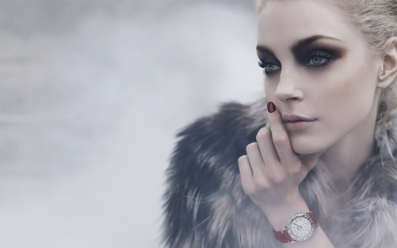
I am looking at different pictures of young females to use as examples for my images. I have chosen to do this due to the fact that I am using a female protagonist. I want to use a low light intensity preferably with a sort of cold wash to connote her almost heartless robotic emotions.

I really like the focus on her eyes in this photo as the eyes are the window to the soul and you can see the true emotion behind the image.I like the strong almost angry facial expression of this girl I think it gives the strong sense of character that I need for my film. I like the fact her eye line is looking away/past the audience this is rather mysterious and makes me as an audience member wonder what or who she is looking at.
 I like the composition of this image. It'd be really good for a film poster as the blank spacing could be useful to add the title and things onto without distracting from the image itself. I wouldn't use the pose that this model is as it isn't strong enough for my character. I am probably going to have my girl holding a weapon so it won't be a close up of the face more like a full body image shot.
I really like the focus on her eyes in this photo as the eyes are the window to the soul and you can see the true emotion behind the image.I like the strong almost angry facial expression of this girl I think it gives the strong sense of character that I need for my film. I like the fact her eye line is looking away/past the audience this is rather mysterious and makes me as an audience member wonder what or who she is looking at.
I like the composition of this image. It'd be really good for a film poster as the blank spacing could be useful to add the title and things onto without distracting from the image itself. I wouldn't use the pose that this model is as it isn't strong enough for my character. I am probably going to have my girl holding a weapon so it won't be a close up of the face more like a full body image shot.
FIRST ATTEMPT AT MY POSTER

I chose to use red as my house style as red is said to represent action, confidence, courage and vitality which is what I would like my protagonist to be like.
I have used the 'Salt' film poster as an example. What I took from the poster is the layering of the film title- One main one and also I added a layer in which I altered the opacity of the text and spread it out over the entire image size. I think this gave it a graffiti look and also a ghostly feel.
I felt like a lot of thriller posters portray their genre through the tag line. Tag lines have to fit into certain things to be classed as 'good' tag lines.
- Suitability: How well does the tagline capture the central theme, appeal, or essence of the film?
- Creativity: Is the tagline clever, playful, humorous, ironic, etc. – expressing its message in a fun and creative way?
- Originality: Is the tagline surprising, disarming, or uncommon – revealing a unique or unusual attitude or point of view?
- Memorability: Does the tagline demonstrate an ability to influence popular culture and language?
http://www.taglineguru.com/moviesurvey.html- has asked respondents to rank their top 10 movie taglines based on the above criteria This is what they came up with:
1.
|
In space no one can hear you scream.
|
Alien (1979)
| |
2.
|
Houston, we have a problem.
|
Apollo 13 (1995)
| |
3.
|
They’re back.
|
Poltergeist II (1986)
| |
4.
|
We are not alone.
|
Close Encounters of the Third Kind (1977)
| |
5.
|
Just when you thought it was safe to go back in the water.
|
Jaws 2 (1978)
| |
6.
|
Who ya gonna call?
|
Ghostbusters (1984)
| |
7.
|
A long time ago in a galaxy far, far away
|
Star Wars (1977)
| |
8.
|
Be afraid.Be very afraid.
|
The Fly (1986)
| |
9.
|
The list is life.
|
Schindler’s List (1993)
| |
10.
|
Earth.It was fun while it lasted.
|
Armageddon (1998)
|
What I have gathered from the tag lines is that they shouldn't be too long, they should be mysterious and intrigue the audience into watching the film. They should be straight to the point and give an insight to what the film will contain. From this information I created my tag line of:
'She's not as innocent as she may appear.'
I added the generic content of a film poster:
- A website: www.bellatrix.com- so that people can access more information about the film like where it's being shot, the actors, premiere information etc.
- Production company: Luja productions
- The release date: June 11th 2013- The summer month so teenagers and adults will have more money and time to go see it. It will also gain more time for publicity build up for any film competition/award things.
- The Title
- The tag line
This poster is my first attempt at doing a film poster. I will try and create another but with my own image and possibly add/ change the tag line to a more dramatic one. I may also change the layout of my title etc.
Friday, 16 November 2012
poster colour scheme
Red symbolizes: action, confidence, courage, vitality
Pink symbolizes: love, beauty
Brown symbolizes: earth, order, convention
Orange symbolizes: vitality with endurance
Gold symbolizes: Wealth, prosperity, wisdom
Yellow symbolizes: wisdom, joy, happiness, intellectual energy
Green symbolizes: life, nature, fertility, well being
Blue symbolizes: youth, spirituality, truth, peace
Purple symbolizes: Royalty, magic, mystery
Indigo symbolizes: intuition, meditation, deep contemplation
White symbolizes: Purity, Cleanliness
Black symbolizes: Death, earth, stability
Grey symbolizes: Sorrow, security, maturity
I looked at the deeper meanings of colours. This is to help me choose my house style colours. I think that I will be using reds/oranges, blues,greys and possibly pinks to really help to connote these meanings.
I got these connotations from various different places online and merged a few of the meanings from different websites together to get the most common connotations.
examples
I have looked at one of my friends short films for inspiration for a few of my shots. I really like the shot of the young boy looking out into the camera I think that it really engages the audience. I like the depth of field of this image with the in focus boy and the almost blurred woods.I think that this makes you focus on the character rather than the setting.
ZOI from Oliver Hollingdale on Vimeo.
ZOI from Oliver Hollingdale on Vimeo.
Thursday, 8 November 2012
Friday, 2 November 2012
Film pitch. 1
This is my first attempt at creating a pitch for my film, it is not completely done as i'm struggling with a successful synopsis but, that can always be improved upon.
Subscribe to:
Comments (Atom)