I have noticed that a lot of thrillers are infact set in icy conditions- Films such as Hanna, Deadfall and Whiteout and countless more. I think this gives a harsh enviroment to add to the action happening. It could also be denoting the heartless emotion of the villianous characters.
I am interested in using this factor of thrillers but due to the lack of funding I can't fly out to a snowy area of the world or buy a giant snow machine.I could however add a filter with a blue tint to give the cold feel to the film.

Friday, 30 November 2012
Improving my film pitch
Improving my film pitch:
Here is the feedback that my teacher gave me on my film pitch.
Y13 Film pitch
Presentation Feedback
You presented very clearly although a little speedly. Stand whilst you present, as it is more formal and you can move around making eye contact with the audience so they know you are speaking to all of them. Also try to not read from the slides, cue card will help you do this.
What you need to do
Work your way through this feedback and using the guidance hand out. The extra inclusion of sound/music you would use is an excellent addition to the pitch.
After I read the feedback I decided to add/ change my original film pitch instead of re creating a new one.
Hanna
Hanna (2011) |
Taglines:
Young. Sweet. Innocent. Deadly.Box Office
Budget:
$30,000,000 (estimated)Opening Weekend:
$12,370,549 (USA) (10 April 2011) (2535 Screens)Gross:
$63,782,078 (Worldwide) (7 July 2011)The budget although looking very large is actually considered as an average budget for a movie. I however will be having a pretty much non-exsitant budget. I will be borrowing costume and props and will be using free location spaces such as the woods by my house so I don't have to pay for travel either.
quote:
Hanna: Adapt or die.
Erik: Think on your feet.
Hanna: Even when I'm sleeping.
This is a key conversation in my opinion. It is near the beginning of the film and i think that it really gives the audience an insight to the relationship between Hanna and her father Erik. 'Adapt or die' is also the tag line for the film, I think that I will also incorporate my tag line into the script of my film.
Wednesday, 21 November 2012
MAGAZINE- NAME
My magazine name: Virtue. I have chosen this name due to the fact I really liked it for my film but 'Bellatrix' fitted better so as the name 'Virtue' also fits my film I think it would be appropriate for my film magazine as I want the film magazine to focus on small independent films such as my own, and as I want it to promote my film more than others so I think this will benefit me greatly.
According to google, Virtue means:
According to google, Virtue means:
Noun
|
This is what I believe Nina my protagonist will portray. Also, my magazine is aimed mainly at the female audience and will contain a lot of information and reviews etc. that will be 'nice', it will probably be mainly for the middle class status as the writing will be of a very high standard. I think this is even shown through the title name 'Virtue'.
poster picture stuff
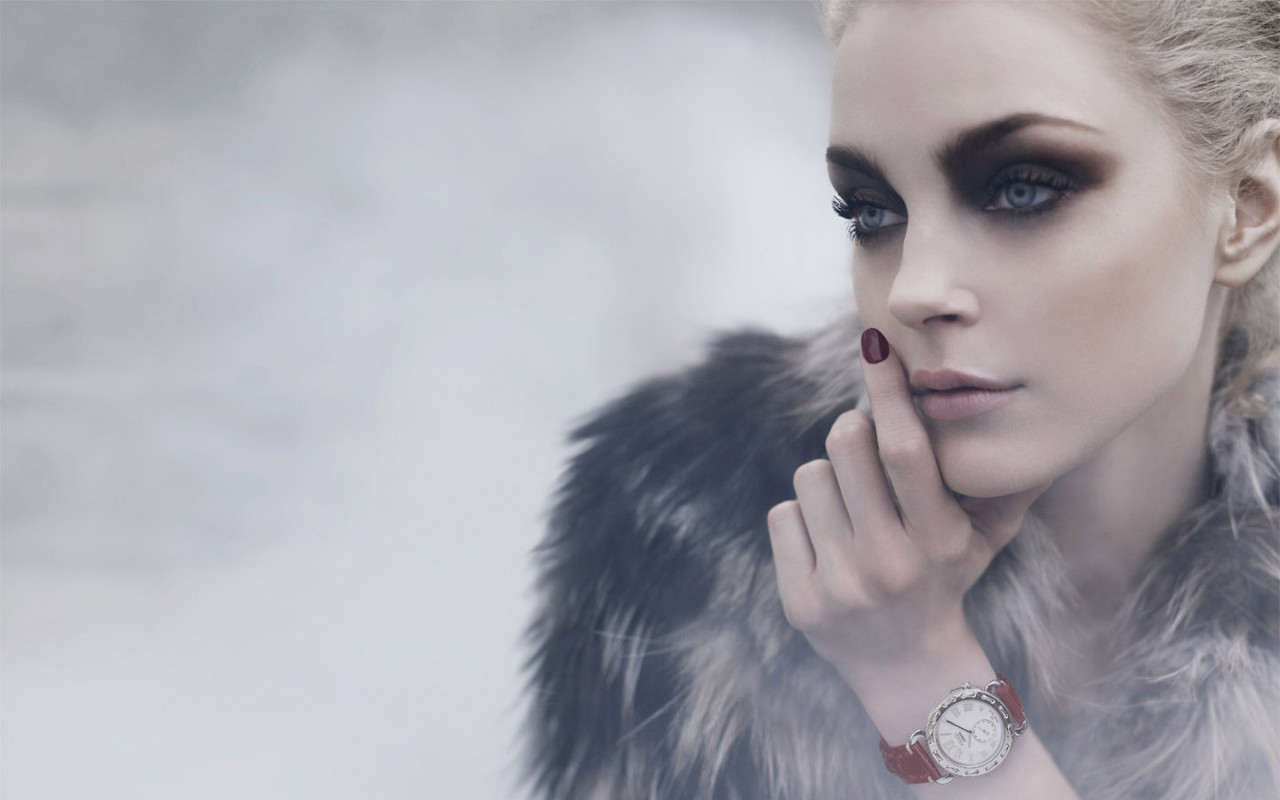
I am looking at different pictures of young females to use as examples for my images. I have chosen to do this due to the fact that I am using a female protagonist. I want to use a low light intensity preferably with a sort of cold wash to connote her almost heartless robotic emotions.

I really like the focus on her eyes in this photo as the eyes are the window to the soul and you can see the true emotion behind the image.I like the strong almost angry facial expression of this girl I think it gives the strong sense of character that I need for my film. I like the fact her eye line is looking away/past the audience this is rather mysterious and makes me as an audience member wonder what or who she is looking at.
 I like the composition of this image. It'd be really good for a film poster as the blank spacing could be useful to add the title and things onto without distracting from the image itself. I wouldn't use the pose that this model is as it isn't strong enough for my character. I am probably going to have my girl holding a weapon so it won't be a close up of the face more like a full body image shot.
I really like the focus on her eyes in this photo as the eyes are the window to the soul and you can see the true emotion behind the image.I like the strong almost angry facial expression of this girl I think it gives the strong sense of character that I need for my film. I like the fact her eye line is looking away/past the audience this is rather mysterious and makes me as an audience member wonder what or who she is looking at.
I like the composition of this image. It'd be really good for a film poster as the blank spacing could be useful to add the title and things onto without distracting from the image itself. I wouldn't use the pose that this model is as it isn't strong enough for my character. I am probably going to have my girl holding a weapon so it won't be a close up of the face more like a full body image shot.
FIRST ATTEMPT AT MY POSTER

I chose to use red as my house style as red is said to represent action, confidence, courage and vitality which is what I would like my protagonist to be like.
I have used the 'Salt' film poster as an example. What I took from the poster is the layering of the film title- One main one and also I added a layer in which I altered the opacity of the text and spread it out over the entire image size. I think this gave it a graffiti look and also a ghostly feel.
I felt like a lot of thriller posters portray their genre through the tag line. Tag lines have to fit into certain things to be classed as 'good' tag lines.
- Suitability: How well does the tagline capture the central theme, appeal, or essence of the film?
- Creativity: Is the tagline clever, playful, humorous, ironic, etc. – expressing its message in a fun and creative way?
- Originality: Is the tagline surprising, disarming, or uncommon – revealing a unique or unusual attitude or point of view?
- Memorability: Does the tagline demonstrate an ability to influence popular culture and language?
http://www.taglineguru.com/moviesurvey.html- has asked respondents to rank their top 10 movie taglines based on the above criteria This is what they came up with:
1.
|
In space no one can hear you scream.
|
Alien (1979)
| |
2.
|
Houston, we have a problem.
|
Apollo 13 (1995)
| |
3.
|
They’re back.
|
Poltergeist II (1986)
| |
4.
|
We are not alone.
|
Close Encounters of the Third Kind (1977)
| |
5.
|
Just when you thought it was safe to go back in the water.
|
Jaws 2 (1978)
| |
6.
|
Who ya gonna call?
|
Ghostbusters (1984)
| |
7.
|
A long time ago in a galaxy far, far away
|
Star Wars (1977)
| |
8.
|
Be afraid.Be very afraid.
|
The Fly (1986)
| |
9.
|
The list is life.
|
Schindler’s List (1993)
| |
10.
|
Earth.It was fun while it lasted.
|
Armageddon (1998)
|
What I have gathered from the tag lines is that they shouldn't be too long, they should be mysterious and intrigue the audience into watching the film. They should be straight to the point and give an insight to what the film will contain. From this information I created my tag line of:
'She's not as innocent as she may appear.'
I added the generic content of a film poster:
- A website: www.bellatrix.com- so that people can access more information about the film like where it's being shot, the actors, premiere information etc.
- Production company: Luja productions
- The release date: June 11th 2013- The summer month so teenagers and adults will have more money and time to go see it. It will also gain more time for publicity build up for any film competition/award things.
- The Title
- The tag line
This poster is my first attempt at doing a film poster. I will try and create another but with my own image and possibly add/ change the tag line to a more dramatic one. I may also change the layout of my title etc.
Friday, 16 November 2012
poster colour scheme
Red symbolizes: action, confidence, courage, vitality
Pink symbolizes: love, beauty
Brown symbolizes: earth, order, convention
Orange symbolizes: vitality with endurance
Gold symbolizes: Wealth, prosperity, wisdom
Yellow symbolizes: wisdom, joy, happiness, intellectual energy
Green symbolizes: life, nature, fertility, well being
Blue symbolizes: youth, spirituality, truth, peace
Purple symbolizes: Royalty, magic, mystery
Indigo symbolizes: intuition, meditation, deep contemplation
White symbolizes: Purity, Cleanliness
Black symbolizes: Death, earth, stability
Grey symbolizes: Sorrow, security, maturity
I looked at the deeper meanings of colours. This is to help me choose my house style colours. I think that I will be using reds/oranges, blues,greys and possibly pinks to really help to connote these meanings.
I got these connotations from various different places online and merged a few of the meanings from different websites together to get the most common connotations.
examples
I have looked at one of my friends short films for inspiration for a few of my shots. I really like the shot of the young boy looking out into the camera I think that it really engages the audience. I like the depth of field of this image with the in focus boy and the almost blurred woods.I think that this makes you focus on the character rather than the setting.
ZOI from Oliver Hollingdale on Vimeo.
ZOI from Oliver Hollingdale on Vimeo.
Thursday, 8 November 2012
Friday, 2 November 2012
Film pitch. 1
This is my first attempt at creating a pitch for my film, it is not completely done as i'm struggling with a successful synopsis but, that can always be improved upon.
Wednesday, 24 October 2012
magazine
My magazine will be of the film genre type. It will be specifically aimed at new upcoming films, new film festivals/ film festival awards that recognise new directors etc. The edition of the magazine that I will create will specify in Thrillers for example Looper, Taken 2 and Argo. the cover will feature my star. It will include a section on me as a director also as indicated by one of the cover lines.
magazine layout
Here I looked at the layout of a generic magazine cover and identified what each section was named at where each part was placed to really emphasise it's purpose.


Here my teacher gave me a flat plan of a magazine and told me to create just with words a magazine aimed for pre-teen to teenage boys.
As the picture isn't very clear I'll just outline what I have written. I have chosen for my Masthead- a simple font with no fancy bits- making it slightly more masculine and the colour to be Black with a white or red outline. This whilst making it stands out doesn't compromise of the masculinity.
I haven't done any logos as I personally think that a logo can cheapen the look of a magazine, and can also be seen as too feminine.
For my tag line I want some slogan like 'Best boys mag in town' or something along those lines. I would like it written in black and in bold and capitals- for easy reading and it catches the audience's eye.
For my incentive I have chosen to have a large yellow star with 'FREE POSTERS!' written in it, the yellow isn't feminine but is very eye catching which works out perfectly.
My cover lines I would have either side of the models image, I would have written things like: 'How to get the girls- 10 top tips.' 'Sport- How to be the best.' 'New tunes' 'Style tips- How to impress 'n' be da best!' Things that young males would either relate to or would be impressed by.
The cover star I think would have to either be a sporting star like David Beckham, a current musician like Ed Sheeran or an actor/actress such as Chris Hemsworth or Mila Kunis. They would have to be attractive and have something to do with the content of the magazine, so the sporting star would in my opinion be the safest option.

Magazine
Different types:
- Glamour
- Fashion
- Gossip
- Sports
- Gaming
- Lads mag
- Music
- Teen
- Film
- Porn
- Gadget
- Hobbies/interests
- Agricultural
- TV guide
- Well-being
- Fitness
- Newspaper
These are the different types of magazines that I could think of, for my magazine, I will have to choose what type of magazine it would be and a lot of them wouldn't fit in with a film at all eg. the Agricultural and others would rely too much on the star eg. Fashion. As I'm not using well known actors this would be a problem.
I have whittled it down to a few options that I could use and they are:
- Music- as I could talk about the soundtrack chosen
- Film- for obvious reasons.
- Newspaper- Newspapers often help to promote local people creating something artistic
- Teen-This would depend on who your target audience is though and the age rating given, it would have to be a U, PG or a 12.
- Lads mag- Lads mags often have bits about films but I think that the genre of the film would have to be an action/ horror or have a famous actor in it for it to be placed into a lads mag.
I think that my best bet is Music magazines or Film magazines.
I analysed one of each to help me to decide.
Tuesday, 23 October 2012
graphic narrative analysis
Here I have done a brief analysis of two different graphic novels one is Superman and the other is Crankshaft.
Superman
Audience
When creating my film trailer I am going to have to consider who i'm going to aim it at. I need to consider various different things such as age, gender, ethnicity, economic status and more. I looked at The Beano as one example.

BEANO
Target audience: Boys/ children- dennis is the focus and young boys want to be as rebelious as him.
Age: 7-12 years old- Boys at this age can relate to Dennis, any older and they grow out of it.
Education: Comprehensive schooling as it focuses on the misbehaviour of Dennis and Dennis takes the mickey out of Walter for being rich.
Economic status: Dennis is poor, Walter is rich, Mickey take of Walter but Dennis is cool. Working class?
Ethnicity: White British. No other ethnicities involved in the Beano
Gender: Boys/male- boyish behaviour, potty behaviour.
VAL's: Working class jobs. Mum= traditional. Behaviour= school boy behaviour.
You watch the story through Dennis' eyes. You're on his side. He's in every single shot. Dennis is cool, he's the leader.
gender representation
Females


Black characters:

Black characters rarely appear in old comics but when they do they are portrayed as:

The Falcon is the first superhero of African descent not to have the word "black" as part of his superhero name. Although The Falcon first appeared in Captain America #117 (September 1969) he hadn't really been seen in the public so the black culture didn't really have any superheroes to look up to until he appeared in the 2012 'Shawowland' storyline after which he becomes an operative in the new incarnation of the Heroes for hire team in the book of the same name. He later appears in the 2012 Avengers vs. X-men.

What is shown here?
- Boobs
- Legs
- Reds
- Yellows
- Sexy
- Skin tight clothing- revealing
- High heels- impractical but makes the character look more feminine as heels make your legs look longer and bum bigger.
Women are represented in graphic novels and films as sexual objects. They are always saved by the male characters or they help men. They are rarely the centre of attention more just side stories. Women are generally portrayed as weak and vulnerable, there are a few exceptions to this rule for example Lara Croft. For my film I will try to go against the female stereotypes as much as possible without making a character too alien to what the commerical audience is used to.
Men
Men are shown in comic books as:
- Masculine
- Strong
- Dominant
- Main characters- therefore a lot more important
- Womanisers
Black characters:
Black characters rarely appear in old comics but when they do they are portrayed as:
- Poor
- Rebels/naughty
- Thieves
- Plain
- Criminal
- Really muscular or skeletal
- Aggressive
The Falcon is the first superhero of African descent not to have the word "black" as part of his superhero name. Although The Falcon first appeared in Captain America #117 (September 1969) he hadn't really been seen in the public so the black culture didn't really have any superheroes to look up to until he appeared in the 2012 'Shawowland' storyline after which he becomes an operative in the new incarnation of the Heroes for hire team in the book of the same name. He later appears in the 2012 Avengers vs. X-men.
Image analysis
I looked at graphic narratives, other than the stereotypical comic book. I have looked at some work done by Dave Mckean.

'David McKean is an English illustrator, photographer, comic book artist, graphic designer
filmmaker and musician. His work incorporates drawing, painting, photography, collage, found
objects, digital art and sculpture.' Wikipedia

The illustration that I looked at showed different images of trees, leaves, an old man dead in bed, railway tracks, roadsigns, baseball ball. What I like about this graphic novel page is the fact it doesn't look like the typical novel, it incorporates pictures with drawings and paintings. He uses a lot of yellow and green tones. This gives a sepia effect giving the impression of age. The yellow and greens are natural colours, this could be connoting that the life cycle this man in the story has gone through is natural and is something we will all have to face.The overall feel of the piece is depressive,dark, gloomy, tragic.
Although it doesn't look like a normal graphic novel it does follow a lot of the conventions of graphic novels. It has frameing and internal dialouge but the mixture of photography, collages and drawings gives it an individual feel to it.
Although it doesn't look like a normal graphic novel it does follow a lot of the conventions of graphic novels. It has frameing and internal dialouge but the mixture of photography, collages and drawings gives it an individual feel to it.
Monday, 22 October 2012
Uses and gratification theory
Uses and gratification theory.
It is an approach to understanding why people actively seek out specific media outlets and content for gratification purposes. The theory discusses how users proactively search for media that will not only meet a given need but enhance knowledge, social interactions and diversion- http://en.wikipedia.org/wiki/Uses_and_gratifications_theory
I applied this theory to my personal life:
Entertainment(Excapism, relaxing,fill time, emotional release):
Next top model/Jonathon Ross show- I like these shows because it's easy viewing, I don't have to sit there and figure out the plot etc.
Information (Social or psycological needs of the individual):
House- Why I like House- It's a medical drama, which I just find really interesting. I find Hugh Laurie very attractive, so it gives a physical and mental attraction to the TV programme. It makes me think a lot as in each episode a lot of enigma codes are sent out to the audience and often you are left on a suspenseful ending which will draw you into the next episode and it subtly teaches morals and work ethics. I think that although it is still easy viewing opposed to documentaries it still feeds into the audience information which I think is very effective. I don't think that it's meant to be aimed at me, I feel as though it's aimed more at the older generation as in the TV series they deal with a lot of issues that possibly would draw you in more if you'd of been through them yourself but I just came across it a while ago and just found it amusing as the jokes within it suit my idea of comedy.
Interagation/social interaction (gratification from the content/media itself [specific genre,social content]):
X-Factor- I don't really like it as a show and I believe that the majority people on it do just go on it for the money so in some aspects I really dislike it, but, in the opening weeks it gives everyone an excuse to laugh at the bad acts and this means that people talk about it and communicate through texts or talk about it the next day. For me personally it's all over my Facebook news feed, all over my twitter and my mum forces me to watch it with the family. I think it's one of them shows that is a key way for a lot of people of any age group to interact.
Personal Identitity:
Missing Andy/ The King Blues.- I really like these bands as I think they appeal to my age group and also the working class. They both sing about different political issues which I think is very interesting and it's something that I really connect with.
An example that fits into a few of these categories for me is the singer Bruce Springsteen.
I have grown up with the music due to my father drumming it into me as good music to listen to, listening to his music has taught me a lot of morals, and political thoughts of the working class background which is a category I personally fit into (Personal identity).
Listening to Bruce has allowed me to talk about him and his new songs and old stuff with my father. I have also found something in common with a lot of strangers by just listening to this artist so has allowed me to gain social interaction. His music is very catchy and also a lot of it I use for relaxation so it gives me something to use for escapism too- Entertainment. Although I don't think that this artist is aimed at my gender or age group, I do believe that his music is aimed at the working class people, so by just slotting into one category I have really enjoyed his work.
Looking at Springsteen as an example it has really made me think as to why people will want to watch my film and how I can capture certain people just by the trailer.
It is an approach to understanding why people actively seek out specific media outlets and content for gratification purposes. The theory discusses how users proactively search for media that will not only meet a given need but enhance knowledge, social interactions and diversion- http://en.wikipedia.org/wiki/Uses_and_gratifications_theory
- Preferred/Dominant reading - The writer/producer's main aim, the viewer will enjoy it and it will fit their age group, gender or the target audience.
- Negotiated - The audience will consider viewing the media form, but perhaps reluctantly.
- Oppositional - The audience will refuse to watch the media form
I applied this theory to my personal life:
Entertainment(Excapism, relaxing,fill time, emotional release):
Next top model/Jonathon Ross show- I like these shows because it's easy viewing, I don't have to sit there and figure out the plot etc.
Information (Social or psycological needs of the individual):
House- Why I like House- It's a medical drama, which I just find really interesting. I find Hugh Laurie very attractive, so it gives a physical and mental attraction to the TV programme. It makes me think a lot as in each episode a lot of enigma codes are sent out to the audience and often you are left on a suspenseful ending which will draw you into the next episode and it subtly teaches morals and work ethics. I think that although it is still easy viewing opposed to documentaries it still feeds into the audience information which I think is very effective. I don't think that it's meant to be aimed at me, I feel as though it's aimed more at the older generation as in the TV series they deal with a lot of issues that possibly would draw you in more if you'd of been through them yourself but I just came across it a while ago and just found it amusing as the jokes within it suit my idea of comedy.
Interagation/social interaction (gratification from the content/media itself [specific genre,social content]):
X-Factor- I don't really like it as a show and I believe that the majority people on it do just go on it for the money so in some aspects I really dislike it, but, in the opening weeks it gives everyone an excuse to laugh at the bad acts and this means that people talk about it and communicate through texts or talk about it the next day. For me personally it's all over my Facebook news feed, all over my twitter and my mum forces me to watch it with the family. I think it's one of them shows that is a key way for a lot of people of any age group to interact.
Personal Identitity:
Missing Andy/ The King Blues.- I really like these bands as I think they appeal to my age group and also the working class. They both sing about different political issues which I think is very interesting and it's something that I really connect with.
An example that fits into a few of these categories for me is the singer Bruce Springsteen.
I have grown up with the music due to my father drumming it into me as good music to listen to, listening to his music has taught me a lot of morals, and political thoughts of the working class background which is a category I personally fit into (Personal identity).
Listening to Bruce has allowed me to talk about him and his new songs and old stuff with my father. I have also found something in common with a lot of strangers by just listening to this artist so has allowed me to gain social interaction. His music is very catchy and also a lot of it I use for relaxation so it gives me something to use for escapism too- Entertainment. Although I don't think that this artist is aimed at my gender or age group, I do believe that his music is aimed at the working class people, so by just slotting into one category I have really enjoyed his work.
Looking at Springsteen as an example it has really made me think as to why people will want to watch my film and how I can capture certain people just by the trailer.
Graphic novel research
I'm looking into graphic novels at the moment due to the fact media can be portrayed in various different ways, movies is just one medium, another is graphic novels. I think that looking at graphic novels will help me later on with my designs for my film poster and magazine cover by allowing me to see different styles that are just in graphic novels alone. I also think it'll be very helpful when it comes to storyboarding for my film.
I looked at two different ways of telling the same story and which I thought was more effective. The first that I looked at was Silhouetted images.
I think that this is a very simple way to tell a story and was good for me as it doesn't require much artistic talent as it doesn't require detail. I do think that it can almost alienate an audience though as as you can't see any detail, you can't see facial features and so it's obviously a lot harder to connect with. I do think that there is better methods but, as a quick simplistic drawing it's a great technique.

 The only thing that I dislike about manga is the way that it is read but I could always change that to suit me when i'm creating my storyboard.
I looked at two different ways of telling the same story and which I thought was more effective. The first that I looked at was Silhouetted images.
I think that this is a very simple way to tell a story and was good for me as it doesn't require much artistic talent as it doesn't require detail. I do think that it can almost alienate an audience though as as you can't see any detail, you can't see facial features and so it's obviously a lot harder to connect with. I do think that there is better methods but, as a quick simplistic drawing it's a great technique.

I then moved onto looking at the style of Manga. I chose to do Manga after looking at Silhouette as i think it provides a massive contrast as Manga is all about the bold colourations. I feel like the simple detailing was a lot more effective in telling the same story. i like the way that it's very quick and simple to do as you can portray emotion through simple icons, such as an exclamation mark for anger and a tear drop for upset. With manga colours are a key for showing different emotions for example:
red= anger
blue=upset
green= jealousy

Contrast in English and American narratives
contrast on Prezi
In this prezi presentation I was looking at the generalization of mainstream cinema products. Whilst looking at the comparison between the two, as a citizen of the United Kingdom so being a British director myself I would stick to the English conventions and not be afraid of what the conventional commercial audience are looking for at the moment, I would be looking to test the audience's comfort zone. This may work out well, or it could seriously limit my audiences and be a massive downfall. I have no choice but to keep the film low budget with unknown actors with no real special effects, but I can still create an effective trailer through my different shot choices and angles etc.
In this prezi presentation I was looking at the generalization of mainstream cinema products. Whilst looking at the comparison between the two, as a citizen of the United Kingdom so being a British director myself I would stick to the English conventions and not be afraid of what the conventional commercial audience are looking for at the moment, I would be looking to test the audience's comfort zone. This may work out well, or it could seriously limit my audiences and be a massive downfall. I have no choice but to keep the film low budget with unknown actors with no real special effects, but I can still create an effective trailer through my different shot choices and angles etc.
Narrative Analysis
Looking at Vladimir Propp's theory of characters, which is a well known idea used by most Directors be it in a comic book, film or game.
I applied this theory to different films, first focusing on Disney classics Lion King and The Little Mermaid:
The Lion King:
VILLIAN: Scar
DISPATACHER:Scar
HELPER: Timon and Pumba, Mufasa
PRINCESS: Nala, freedom from scar/ hyenas
DONOR: Zazu, Timon and Pumba
HERO: Simba
FALSE HERO: Scar
The Little Mermaid:
VILLIAN:Ursula
DISPATACHER:Ursula
HELPER:Flounder
PRINCESS:Ariel
DONOR: Sebastien
HERO:Eric
FALSE HERO:Ursula.
just from using disney films alone, I could see that characters could overlap on their roles for example in the little mermaid Ursula is the villian, dispatcher and the false hero.
To show that it isn't just Disney that follows these character roles i decided to look at the Harry Potter film series:
VILLIAN: Voldemort as he tries to kill Harry and rule the world
DISPATACHER: Dumbledore as he guides Harry to defeat Voldemort
HELPER: Ron and Hermione, as they help him along his journey to defeating Voldemort
PRINCESS: Ginny as she gets saved by Harry and eventually marries Harry. Also the defeat of Voldemort
DONOR: Dumbledore as he helps Harry to try to defeat Voldemort
DONOR: Dumbledore as he helps Harry to try to defeat Voldemort
HERO: Harry Potter, he tries to defeat Voldemort and restore the equilibrium in the wizarding world.
FALSE HERO: Draco Malfoy as he, on multiple occasions, tries to take credit for Harry's actions.
When looking at narrative analysis you have to look at more than just the character roles. You have to include:
- Setting
- Characters
- Binary Opposition
- Emotion Content
- Enigma Codes
- Equilibrium- disequilibrium- new equilibrium
- Themes
I applied this to the Hulk comic book.
It was set in the desert shown by the cacti, and the sandy floor which suggests the desert possibly in America.
The main character is Bruce Banner/The Hulk. Who is the Hero/Villain. The alter-ego Bruce Banner/ The Hulk is the binary opposites.
The narrative shows an equilibrium-disequilibrium-new equilibrium which is: The Hulk on the ground- The attack on the Hulk- Hulk being with the girl (princess character) after being attacked.
I would say that the theme of this narrative would be the constant fighting action. The emotional aspects expressed in order to get the viewers attention would be the Hulk bringing in a civilian into the fight. The enigma codes would be 'Will the Hulk save the civilian?'
Monday, 8 October 2012
A2 G324: Advanced Portfolio In Media
The unit requires you to engage with contemporary media technologies, giving you the opportunity to develop your own skills in these technologies. It also enables you to develop the skills of presentation that are required for further study at higher levels and in the workplace.
From this brief you will produce:
From this brief you will produce:
- A media portfolio, comprising a main text.
- A presentation of research, planning and evaluation in digital formats.
The media portfolio will be produced through a combination of 2 or more of the following media:
- Video
Each candidate will reflect upon their work digitally. This evaluation may be done collectively for a group production or individually. Examples:
- A blog
- DVD
- Powepoint
MARKED OUT OF 100.
Evaluation:
In the evaluation the following 4 questions will be adressed:
- In what ways does your media product use, develop or challenge forms and conventions of real media products?
- How effective is the combination of your main product and ancillary texts?
- What have you learned from audience feedback?
- How did you use media technologies in the construction and research, planning and evalutation stages?
Assignment Brief:
You have been commisioned by a production company to create a promotion package for a new film, inspired by an original greaphic narrative idea of your own.
To include a trailer, plus:
- A film magazine front cover, feat. the film.
- A poster for the film.
This will be done in 3 stages:
- Research - including film trailer and graphic narrative case studies. Magazine and poster conven
- Construction - Of your trailer, magazine cover and poster.
- Evaluation - It is recommended that you work on this throughout the first two stages.
Wednesday, 15 August 2012
Genre/Film research
One Flew Over The Cuckoo's Nest- Milos Forman- 1975
Genre- Drama
I like this films poster as it is so simplistic and also really represents the era t was made/ set in. I also like the font and the font colour used in the trailer and how it was over-layed over the shots rather than stopping and starting again. This is something I'd be interested in doing to stop the titles from distracting the audience.
It's main character is played by Jack Nicholson who is well known for playing characters with some sort of mental problem, like in the film 'The Shining'. I think that this must have drawn a large audience in for being familiar with the actor and also knowing what to expect from both the actor and director as Forman is well known for specialising in Dramas.
This film focuses on investigating the minds of the socially deemed 'mental' this is something I think that I would personally find really difficult to create a story line around without it somehow being interpreted as insulting as it's not a very easy topic to come to terms with.
Genre/Film research
Like Crazy- Drake Doremus- 2011
This film is a romance drama. Which is what i'd be quite interested in doing as a personal preference as a genre and also the fact that I do not need amazing actors nor do I need a massive budget, special effects or a specific set unlike if I was doing a western for example.
What I gather from watching the trailer is that the film relies on the story line rather than the glamorous Hollywood style that we are so used to seeing in cinemas now.
I do think however that in the trailer they did choose to give away too much of the story line, which I will be careful to try not to do.
Genre/Film research
Monsters- Gareth Edwards- 2010
This sci-fi-Thriller-Drama film had a tiny budget of $800,000 (estimated) If I was creating this film in real life would be my sort of budget. This made me really look at this film and the sort of things I could create with a low budget.
The trailer for monsters isn't anything with a wow factor but it definitely gets you interested to watch it. It starts off slowly mainly focusing on the (I assume protagonist) taking photos, I really like the enhanced camera shutter sounds, I feel it made me seem closer to the action and also really made me focus on the minor features of the trailer. I feel like the trailer almost over-used titles. It felt like you didn't see enough actual action to be 100 percent involved as it was interrupted too often. I did however like the colour choice of the titles the pitch black background with the ice- blue lettering, I think it really suited the sci-fi genre.
I think the setting choice for this film- Mexico really helped the film by being able to get unusual shots of unique scenery. This is something I need to really think about with my home town of Hastings.
Subscribe to:
Comments (Atom)